

![]()
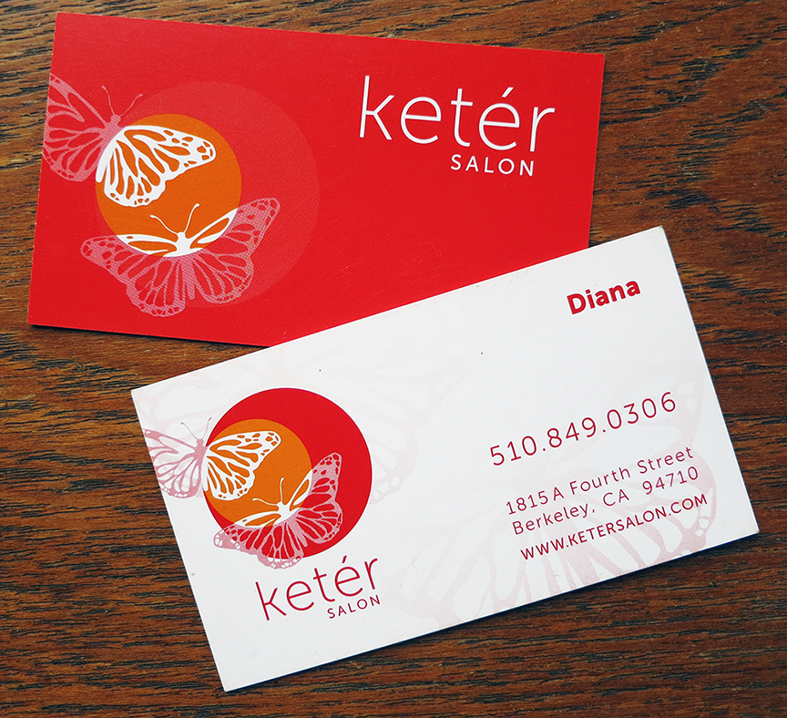
The Keter Salon rebrand was a really fun project. The success of the salon prompted a second location which presented the owner with the perfect opportunity for a rebrand. We began with the logo redesign with flexible branding in mind, and the result is a logo whose elements can be adapted for a wide variety of uses. The second butterfly (representing their second location) adds movement and an opportunity to incorporate transparency to further convey the lightness of the visual elements.

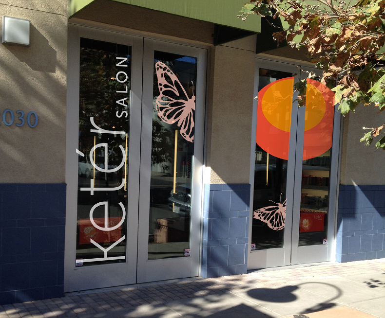
The business & appointment cards engage the flexibility of the brand via alternative positioning of graphic elements tailored to each particular form. Signage for the salon’s second location maximizes the graphics in a way that gets noticed from the street without hindering the natural light the glass doors provide.


